Last year in December, a little dream of mine came true.
The label Herzgut approached me and asked if I would be interested in designing a small collection with them. Of course I didn’t have to think twice!
Herzgut is one of my very first cooperation partners. The brand has been producing fair fashion in Mainz since 2018. It pays attention to sustainability and stands for high-quality, casual, comfortable and minimalist styles.
Exactly mine! Now
even with
exactly this
brand
own collection
would never have
I would never have dared to dream some time ago.
We didn’t have long
g
We met in a video call for a brainstorming session. My head was buzzing with ideas. We exchanged suggestions, ideas and inspiration for quite some time.
from family and friends
my statement was suddenly clear.
“
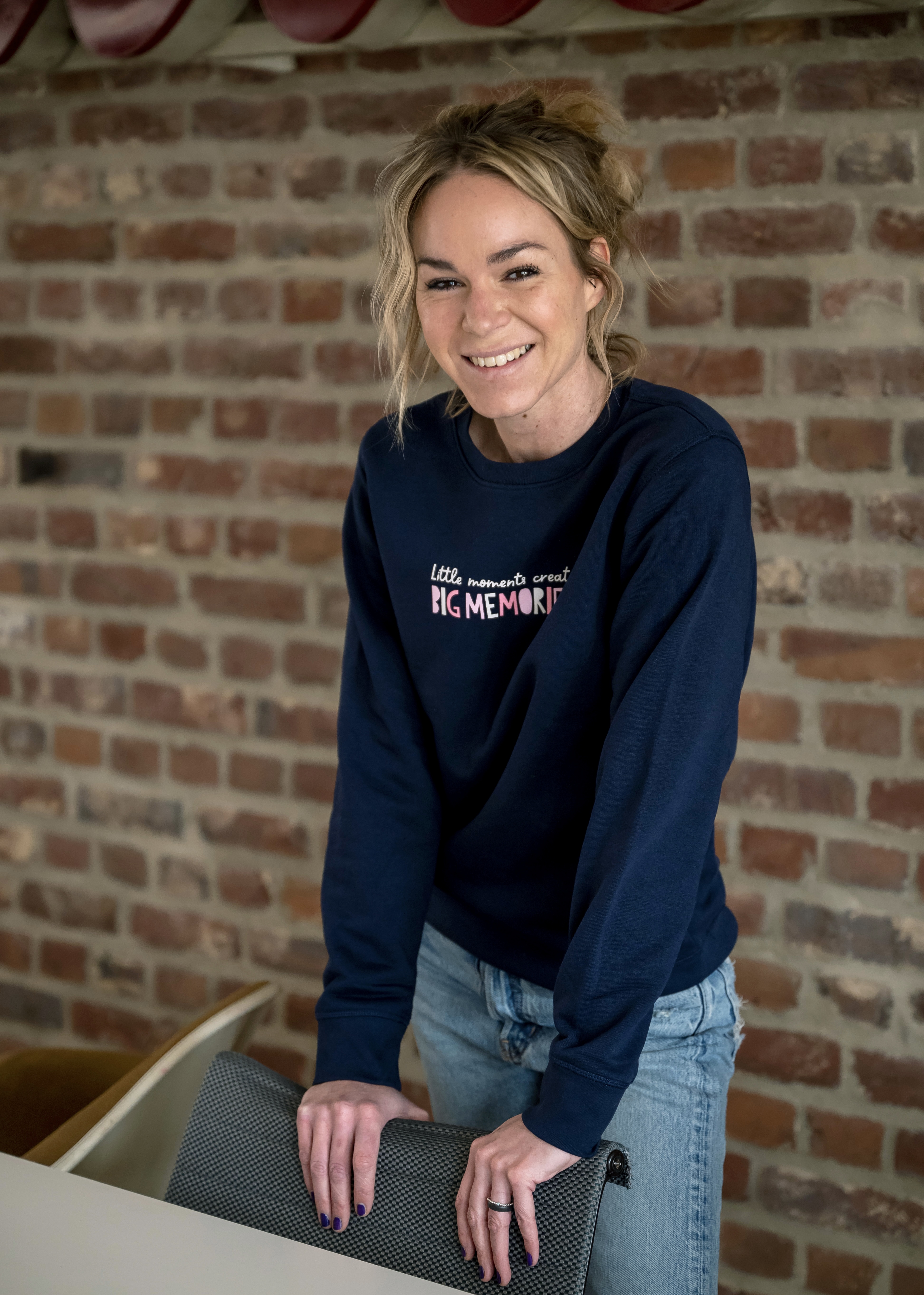
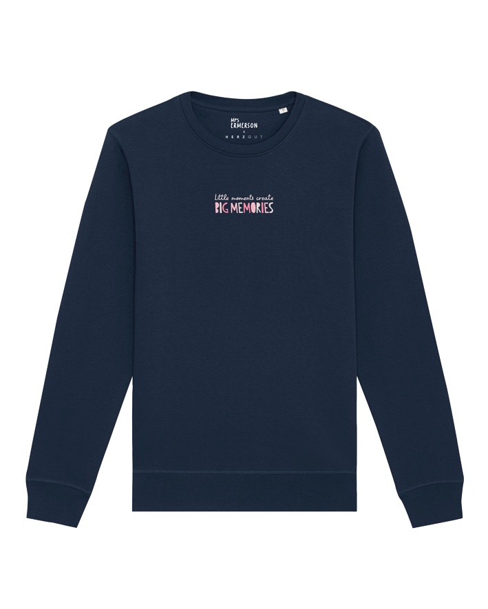
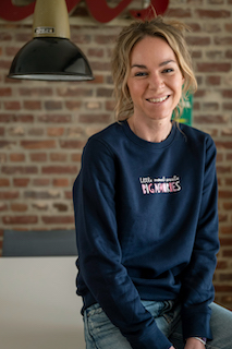
Little Moments create big Memories
“
That was my “good-vibe” statement. I associate it with my childhood. Our old house with the tiled stove, in front of which my brother and I sat in our bathrobes after a bath. I can still smell the fire today and hear the crackling of the flames. I associate this memory with the exact feeling that I associate with this moment.
My print is a reminder of the little moments in life that may not seem important, but which end up being the most precious memories of our lives. Let us appreciate the beauty of the everyday and strive to fully enjoy every moment.
Simple
font or eye-catching font?
Print on the right, left or center and how big? How should I decide, I thought. After much deliberation, I decided
decided to place the
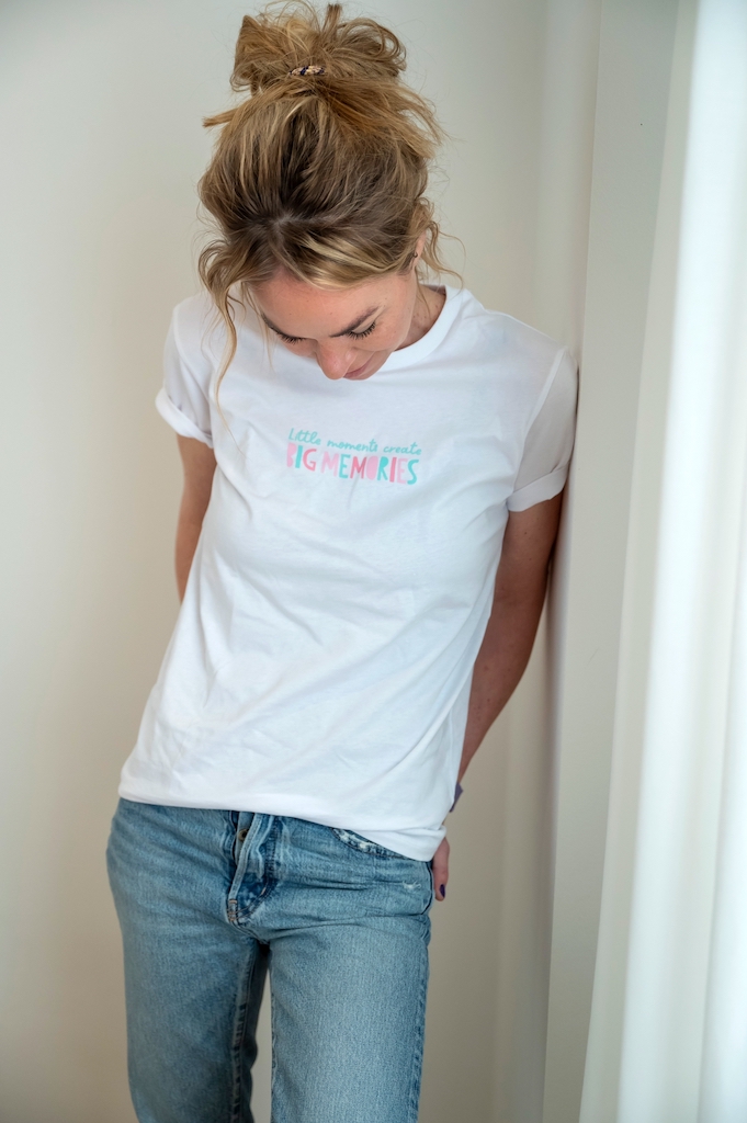
I decided to place the print in the middle, because that’s how it catches the eye the most.
The T-shirt made me think of summer and what could be better than bright and colorful colors.
I wanted white for the base color. The color white can be combined with anything and I wanted to design something for every day.
The font was then allowed to be a little unusual, so I chose the good mood colors turquoise and pink.
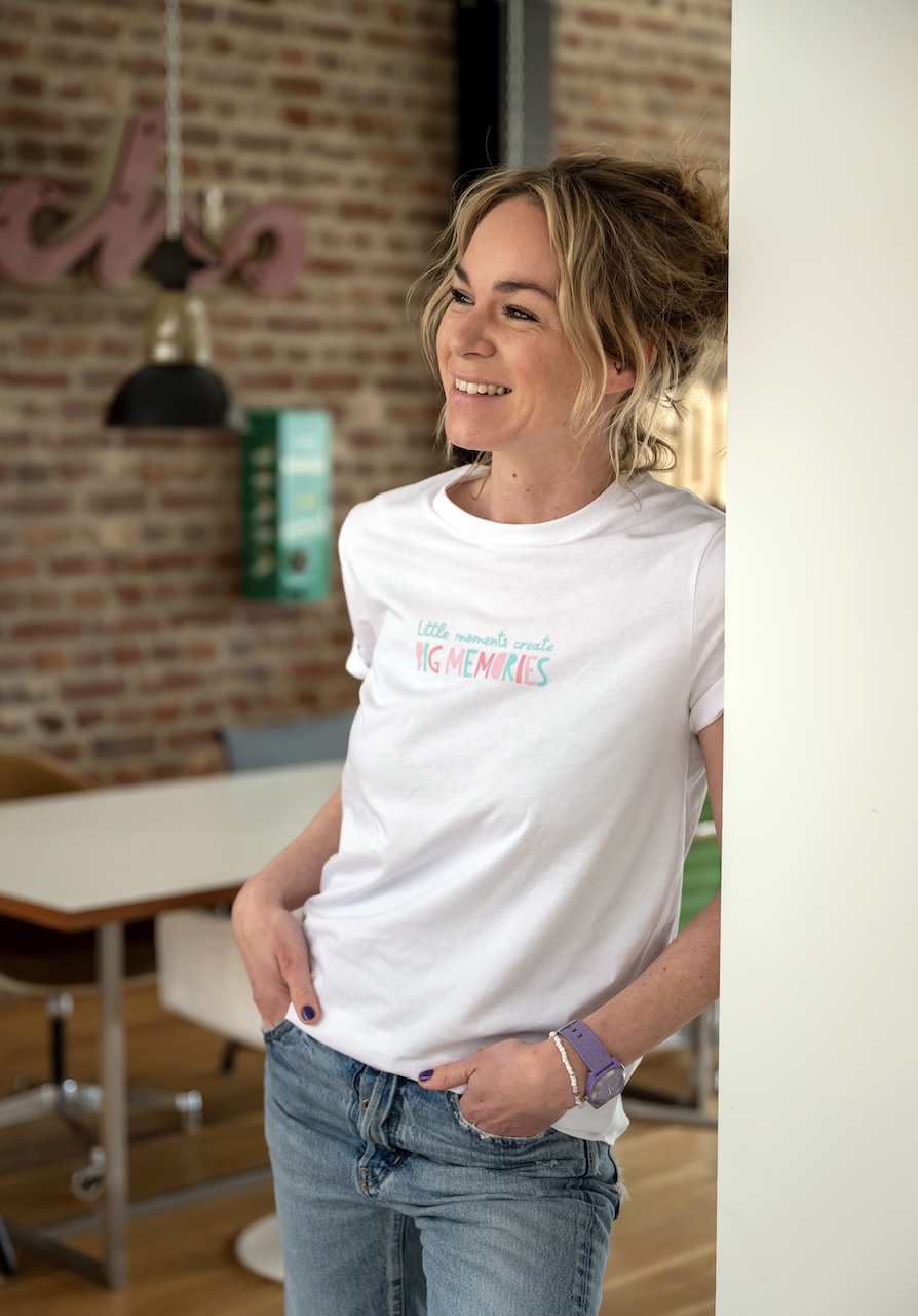
And then it was done. I had designed my own collection. I could only really believe it when I held the garments in my hand and was able to wear them.
I hope you experience many little moments with my collection that will become the most precious memories.
